
Digital signs: The sequinned elephant in the room

I want to talk about digital signs. They are everywhere at this point: in our doctors’ offices, schools, public buildings, next to our roads as billboards, and elsewhere in urban and suburban environments.
I’m a signage and wayfinding consultant at Fathom Studio, a design firm in Nova Scotia. Every day, I work with my team to plan and design signage systems that provide the best outcome for our clients’ sign users. We provide guidance to municipalities, hospitals, universities, trail groups, residences, and other clients. Often, these discussions include whether digital displays are worth considering, and as with all tech, the answer is complicated.
Readers of this magazine will surely agree that digital signs are very effective at:
- Advertising products and services,
- Communicating frequently updated information, like train or airplane departures,
- Telling stories, or interpreting places, artifacts, history,
- Honouring donors,
- Exhibiting visual art.
I’ll provide two examples, one private, one public. The private example is digital signs used in out-of-home (OOH) advertising. Businesses wouldn’t continue spending scads of money on them if they didn’t think those signs increased their revenue and generated sales for their products and services. Digital OOH (DOOH) allows expensive real estate to be sold to multiple clients or to deliver a range of periodically changing messages. The second example is transit. Transit authorities have used digital displays for years in transit terminals to communicate real-time information about when the next subway or bus is coming, reassuring (or angering) riders and at least allowing them to plan accordingly.
But outside of advertising and transit schedules, I often see bad examples of digital signs. Every day, I see signs with screens where:
- The messages are out of date,
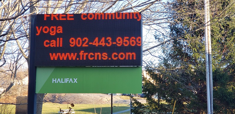
- Digital graphics duplicate what’s on the static part of the sign,
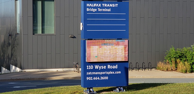
- Digital graphics are distracting and hard to read,
- The equipment is broken,
- Graphics are so bright that the rest of the sign is unusable,
- Signs are communicating too much information.
These signs mar public buildings like arenas, libraries, community centres, and fire stations across Canada. Poorly implemented digital signs at these facilities aren’t outliers; they are the norm.
This results from screens being a “solution looking for a problem.” Institutions see effective digital signs in the world and think: “That’s what I need!” Surely, if they can choose between a static sign that’s expensive to change and a digital sign that can be changed on a whim, the digital sign is the obvious choice.
But reality doesn’t live up to expectations. Here are the issues I see.
Content issues
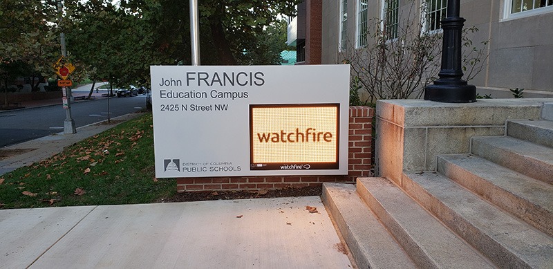
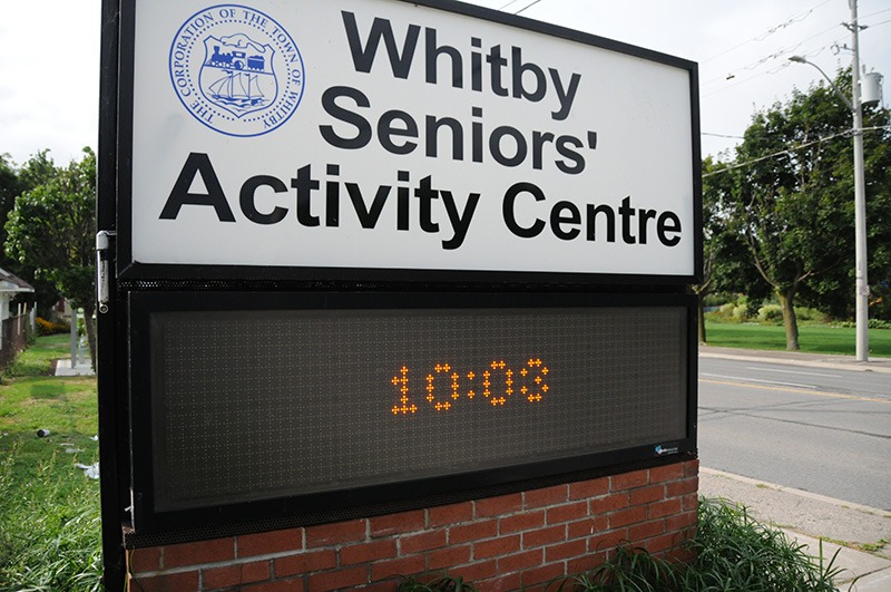
- Clients have trouble using and adjusting the message or graphic on the screen and leave a default message—such as a clock—or a blank sign.
- No one is responsible for controlling, providing messages, or creating graphics for the digital sign; thus, the sign is not updated.
- There is no need for a changeable message, and signs are left unused for long periods.
Durability and longevity
- Technology changes, and aging screens look dated.
- Screens break and are left broken—presumably because the replacement cost exceeds the screen’s importance to owners.
Security
- Digital signs are a target for hackers and vandals. There’s a history of hacking variable message signs (VMS) on roads in the U.S. going back to at least 2007. Digital signs are reliant on software connected to an increasingly dangerous internet.
Environmental and cost control
- Digital signs distract road users and create a lot of light pollution.
- LED signs use far more energy than a static sign.
- Unlike the endlessly recyclable aluminum substrate on traditional static signs, the plastic used in digital signs is usually incinerated or landfilled. Similarly, while electronics recycling programs exist, the process is complex, and recycling rates remain very poor in North America.
- Digital signs need a lot of additional infrastructure in every location: an electrical connection and internet, which may also require expensive trenching.
User experience
- People must be willing to stand and look at the sign for more than a few seconds, and I’ve seen a lot of signs installed in environments where that’s not likely to happen. Many are in high-speed traffic areas, where there isn’t enough time to read the message while driving 60–80 km/h.
- These are also locations where standing and reading a big sign as a pedestrian is unappealing, with loud cars and trucks whizzing by.
Digital signs generally do not help with wayfinding functions. In general, directional and identifying signs change at most once every few years. Where I’ve seen digital signs doing wayfinding jobs, they usually make the wayfinding worse. They make it easy to arbitrarily change the names of places without considering the consequences for how staff and visitors use a space.
This is a trade magazine, and I’m sure that this nuanced message is unappealing for some readers who sell digital signs among their product offerings. There is no question that the visual quality of screens has never been better. Durability is improving, and the environmental footprint of screens is decreasing. Not long ago, new messages were input from a panel on the sign itself. Today, content management systems are all cloud-based, making it easy for the owner to change the messaging on a whole constellation of digital signs all at once. Content can be automated, connected to ever-changing social media, artificial intelligence (AI)-generated personalized information, or other sources without human intervention. However, like all discussions about tech, every feasibility discussion must consider the fundamental objectives of the digital sign and weigh the benefits and costs.
All signs are about communication; if the communication isn’t improved by new technology, we shouldn’t adopt it. As an industry, we benefit from guiding our clients to a result that meets their goals. A client who thinks, “I wish I hadn’t spent so much money on a screen we never use,” is a client who might not call you next time. We have a responsibility to guide our clients to the best possible solution, and sometimes that requires us to dig deeper and sometimes push back against requests when we have the opportunity. Ask: “Instead of a digital sign, is it possible that you’d be better served by producing a better static sign?”
When my clients ask me about digital signs, I ask the following to see if the option is right for them:
- What kind of messages do you want to communicate to your users?
- How will people who see your sign be travelling i.e., by what mode of transportation? Will they be in motion?
- How often do you expect to need to change your messaging? Daily? Weekly? Monthly? Annually? Never?
- Are your changeable messages simple or complex? (It’s a sign. Its messages should never be complex.)
- Do you already have power and internet at this location?
- Do you have someone on staff responsible for creating and updating messages on whatever schedule you decide? If the display is to be fully graphic, do you have a graphic designer to design the layouts?
- What kind of lifespan do you expect from your sign’s screen?
- Are there bylaws limiting digital signage in the candidate jurisdiction?
- Are there alternative design approaches that would be cheaper/simpler/get better results? (e.g., traditional marquee or pull-down letters, changeable tab signs, or perhaps even QR codes)
A few minutes talking it out will help you decide what your client needs and whether the digital sign is warranted by the project, resources, and context they are working with.
Let me reiterate there are undoubtedly great uses for digital signs out in the world. But when your client asks about digital signs, you should always ask them what they are trying to achieve to ensure they get a sign that helps them reach their audiences and goals.
Adam Fine is a planner with a unique passion—signs. He has helped organizations improve their public spaces and rights-of-way with better signage. In concert with his colleagues at Fathom Studio, Fine has worked on interpretive and wayfinding plans for all kinds of clients: municipalities large and small, trail groups, Parks Canada, provincial parks departments, and universities and college campuses.

Sign up for our newsletter
Featuring breaking news from Canada's sign and graphics industry.
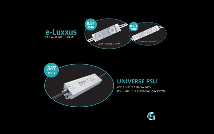
Products


Read the Latest Issue

