
Meet the Maker | Lisa Armstrong: ‘When people see cool dimensional signs, they know where they’re from’
Hello readers!
Welcome to Meet the Makers, a series that takes a playful, engaging approach to showcasing the personalities and expertise of sign pros while staying rooted in the signage industry.
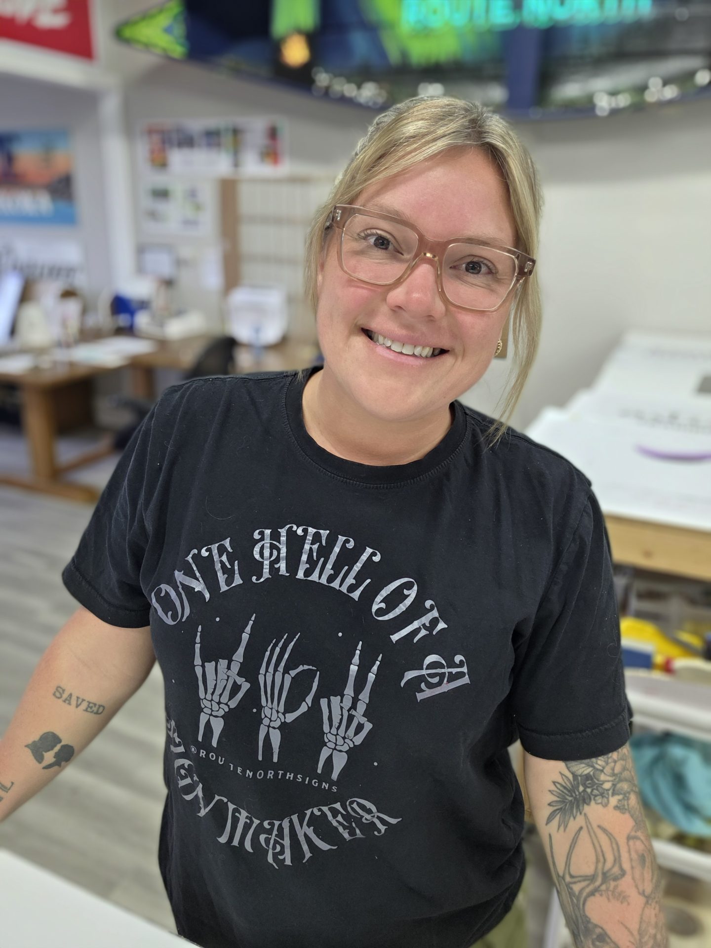
This week, we are featuring Lisa Armstrong, owner of Route North Signs & Graphics Inc. in Muskoka, Ont. Armstrong’s journey in signage began at 18, when she landed her first graphic designer position at her town’s local sign shop. There, she learned the fundamentals of vinyl, materials, and design strategies tailored to signs rather than paper or screens.
Over the past 22 years, Armstrong has worn many hats in the industry, including commercial arts administrator, prepress operator, sign designer, graphic designer, installer, shop manager, and now owner. She credits every shop that employed her for helping grow her knowledge and expertise, and she remains deeply committed to contributing to the signage industry through creativity, skill, and leadership.
Here are her responses to our five offbeat questions.
What’s your sign superpower?
My superpower? Designing dimensional signs for any type of business.
What’s the most challenging project you’ve worked on?
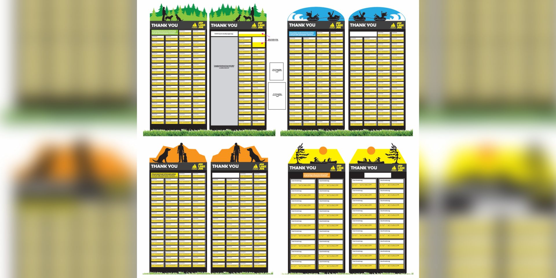
This project is still in the works. We are combining braille, custom-cut dimensional toppers, vinyl prints, and structures for CNIB Lake Joe, a camp run by the Canadian National Institute for the Blind (CNIB), an organization that supports Canadians who are blind, partially sighted, and deafblind. Lake Joe provides accessible recreational experiences so children and adults can enjoy the outdoors safely and inclusively.
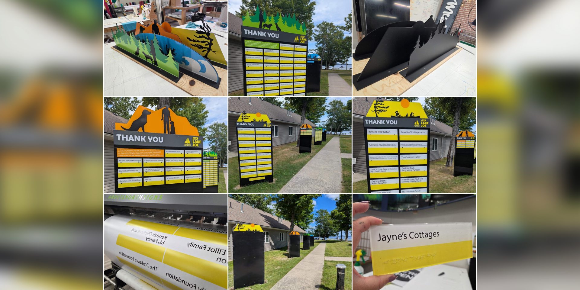
We want to create some beautiful structures on the grounds that honour the donors—these need to be high visibility and include braille for the visually impaired, as well as appealing to those not visually impaired.
Working with the camp, we have built four structures with different dimensional, custom-cut acrylic toppers. The braille plaques are clear, with a full-colour print applied to the back to provide both types of readability.
What’s a favourite sign or sign system you’ve created?
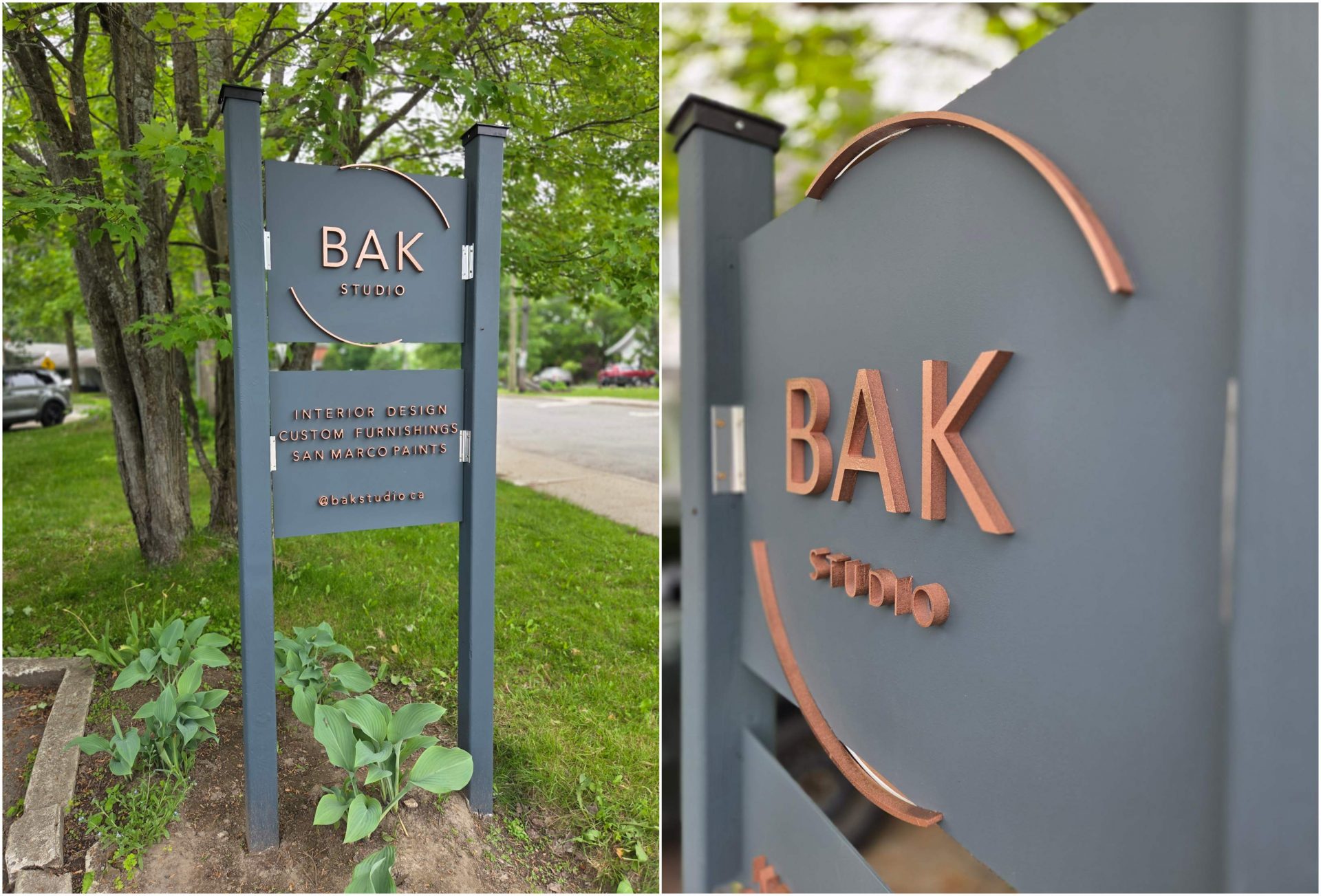
I have too many favourites to choose from. BAK Studio in Bracebridge, Ont., had us make a simple dimensional sign—the colour palette is different from the usual and really shows well.
They are 3 mm (0.118 in.) aluminum composite panels (ACP) painted deep blue/grey. Logo and letters are 12.7 mm (0.5 in.) high-density polyethylene (HDPU) sign foam—primed and painted copper. Also, the detail of the circle going over the panel gives it a nice edge.
If signage could talk, what’s the funniest thing a sign has ever ‘said’ to you?
“I’m not crooked, the building is”—in response to the number of people who walk by when installing and yell out, “It’s crooked!”
What’s the one piece of signage advice you wish everyone knew?
If you’re working with dimensional signs that you cut in-house, the brand of sign foam matters! Some cut much easier than others at the same weight. Sand easier and carve easier—find what works best for you. Using the right materials makes a big difference in the quality and ease of your work. Route North Signs is definitely a reflection of what I enjoy in the sign industry—making cool, dimensional signs. When people see them, they know where they’re from.
***
Here’s to celebrating the industry’s creative minds! See you next time.
Follow Route North:
Website: www.routenorthsignsandgraphics.ca
Instagram: https://www.instagram.com/routenorthsigns/
Facebook: Route North Signs and Graphics
Sign up for our newsletter
Featuring breaking news from Canada's sign and graphics industry.
Popular Articles
-
1
-
2
-
3
-
4
-
5
Read the Latest Issue
