
Guided by design
Timber, typography, and thoughtful design combine at George Brown’s new Limberlost Building
As part of George Brown College’s ongoing expansion and commitment to innovation, the new Limberlost Building marks a significant architectural and academic milestone for the institution. Designed by Moriyama + Teshima Architects in collaboration with Acton Ostry Architects, the 20,903.1 m2 (225,000-sf), 11-storey mass timber building establishes a new benchmark for urban learning environments. Our team was engaged to conceive a custom signage, wayfinding, and environmental graphics program that would seamlessly integrate with the architecture, reflect the college’s identity, and enhance the daily experience of students, faculty, and visitors.
Our scope encompassed the full planning, design, documentation, tendering, and production oversight of a comprehensive, project-specific signage and environmental graphics program. The building’s scale, materiality, and prominence in downtown Toronto, demanded a program that would functionally support navigation while serving as a distinctive and cohesive visual layer within the architectural experience.
The contract
Having recently partnered with Moriyama + Teshima on the wayfinding program for 60 Mobile Drive, the new headquarters of the Ontario Secondary School Teachers’ Federation, our team was approached to help realize George Brown College’s vision for a distinctive, site-specific signage program at Limberlost.
Building on this established working relationship, we joined the project as a sub-consultant, tasked with developing a design language that would complement the architecture while reflecting the college’s culture of innovation, accessibility, and inclusivity. Our prior experience with complex academic and office environments provided the client and architects with confidence that our approach would balance functionality, esthetic refinement, and durability.
The project
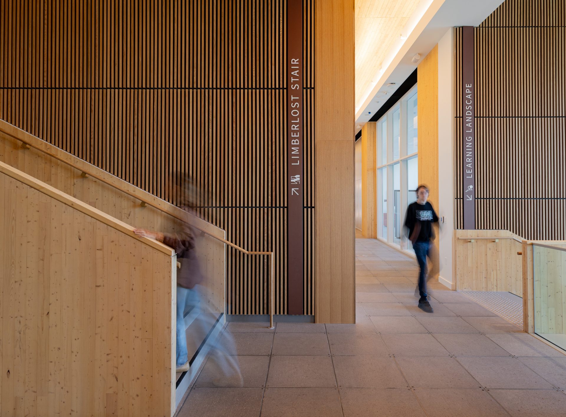
The process began with a conceptual kickoff meeting in August 2023, bringing together the client, architectural team, and our studio to review early design directions and establish performance, esthetic, and user experience goals. From the outset, we aimed to strike a balance between technical functionality—ensuring accessibility, clarity, and long-term maintainability—and a design expression that resonated with the building’s materiality and spatial experience. Drawing inspiration from the exposed timber structure and natural light that define the architecture, we explored ways to integrate warm finishes and materials and precise detailing into a cohesive signage system.

Design continued through the fall and winter, from September 2023 to January 2024, during which we refined the visual and functional aspects of the program through iterative progression and collaborative meetings. This process culminated in a tender-ready specification package, defining the full suite of sign types, materials, mounting methods, and graphic standards. The program was issued for tender in May 2025, followed by fabrication and installation over the summer months to ensure the building was ready for students in September 2025.
The scope
The program consists of more than 500 individual sign instances, ranging from exterior building identification types to interior directional, directory, area, and room identification signs, as well as large-scale level identification wall graphics in the two primary stairwells. Additionally, a donor recognition program is currently being implemented as a direct extension of the wayfinding system, further demonstrating the adaptability and extensibility of the design language.
The scope required a careful calibration of hierarchy, legibility, and architectural integration, ensuring that each sign type fulfilled both functional and esthetic objectives while contributing to a unified program across all levels of the building.
The design
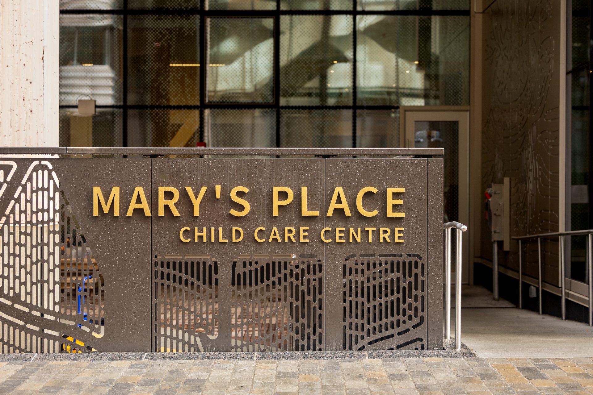
While George Brown College maintains an existing campus-wide signage standard, both the client and architect expressed a strong desire for a bespoke program specifically tailored to the Limberlost Building. In response, we developed an entirely new family of sign types featuring a custom colour palette, refined typographic conventions, and a suite of original pictograms and wayfinding maps.
The system not only aligns with the architecture’s sense of craft and clarity but also emphasizes the legibility and flow through the interior spaces. The only elements retained from the existing standard were two GBC-branded pedestrian pylons at the primary entrances, which we re-specified to improve durability and longevity.
The fabrication
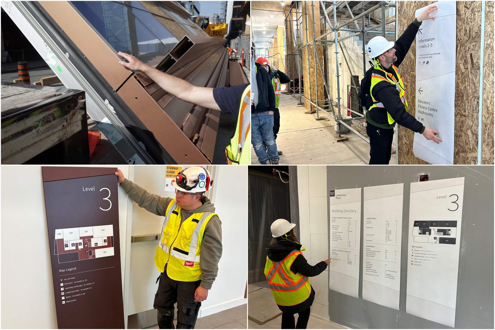
Fabrication was undertaken by Philcan Group, with whom we collaborated closely to translate the design into production. The fabrication phase was highly interactive, involving multiple rounds of shop drawings, prototype reviews, and material submittals to ensure fidelity to the approved design. Our goal throughout this stage was to maintain design precision while accommodating fabrication realities, ensuring that each component balanced technical and esthetic requirements.
The family of sign types spanned all scales and installation locations, including:
- Internally illuminated channel letters on the main entrance canopy
- Lettering affixed to the exterior daycare play area fence
- Room identification signs of varying hierarchy
- Directional signage as both plaques and pin letters
- Elevator and building directories
- Area identification lettering and pictogram instances
Primary materials included laser-cut and painted acrylic with tactile and flat direct-to-face printed lettering, as well as physical vapour deposition (PVD)-coated and painted stainless steel. Each finish was selected for its durability, esthetic clarity, and compatibility with the building’s architecture.
Challenges
One key challenge was finalizing the primary colour palette for the program. The initial selection was deliberately bold and unexpected, intended to contrast with the architecture and spark visual interest. Through an extensive alignment process, the palette was refined to harmonize with interior furniture selection and the unique copper-toned building envelope, resulting in a program that feels integrated with the architecture while maintaining a distinct identity.
Another challenge involved on-site verification of key sign type locations, particularly those that were highly integrated with architectural features, such as large directional signage on wood-slatted walls. While a thorough mock-up process was performed for key sign types like building directories and directionals, multiple site visits were necessary to confirm accurate placement, alignment, and interaction with surrounding materials.
Primary messaging panels of directory, directional, and room sign types were also designed to be replaceable for updating with minimal wastage of materials. Subsequently, the sign faces make use of countersunk and concealed magnets for mounting. Extensive testing was needed to verify the appropriate strength of the adhesion to mitigate typical tampering.
Installation
Philcan Group performed the installation on a floor-by-floor basis. Temporary signage was first installed to satisfy temporary occupancy permit requirements, followed by the final signs. Our team regularly reviewed newly completed installations and co-ordinated closely with both construction management and Philcan, ensuring precision in placement, alignment, and consistency throughout the building. Specialized equipment included lifts and scaffolding where required for overhead signage, and precision tools for alignment and leveling of components.
Conclusion
The completed signage and wayfinding program for the Limberlost Building exemplifies collaborative design at its best. It supports intuitive movement throughout the complex, multi-level structure while reinforcing the architectural character and environmental ethos of the building. More than a navigational tool, the system provides a cohesive and welcoming experience, communicating George Brown College’s identity and commitment to innovation through materiality, form, and detail.
Currently, we are not implementing AI in our design and planning process and have no immediate plans to do so. Our experience demonstrates that successful wayfinding programs emerge when design and esthetics combine with inherently functional elements that are simple, universally accessible, and empower users to navigate independently. Above all, a successful project outcome depends on clear communication between an engaged client, a design team willing to exceed minimum expectations, and a fabrication partner bringing expertise and foresight to the process.
Phillip Novak is the team lead at Strange Colour, Toronto. Founded in 2018 and based in Toronto, Ont., Strange Colour works independently and collaboratively with a focus on planning and design of signage and wayfinding systems and environmental graphics programs.
The team is motivated by the desire to be challenged, delighted, and met by the environments they find themselves in. Their intent is to contribute to spatial initiatives that recognize the ever-evolving spectrum of wants and needs, whether for work, study, or play.

Sign up for our newsletter
Featuring breaking news from Canada's sign and graphics industry.
Products


Read the Latest Issue

