
Dimensional designs: Creating character through 3D foam signage

Using dimensional foam and thoughtful design, Route North brought two visions to life—Bucky’s bold, candy-coloured charm and The Griffin Pub’s timeless, old-world character.
Building Bucky’s
When Kevin, the owner of Bucky’s—Candy Shoppe Muskoka, reached out to us at Route North Signs & Graphics, we already had a great working relationship. We’d previously helped him update the signage for his other business, Muskoka Bearwear, by refacing his existing acrylic pin-mounted signs. We reused the logo and text, reinstalled them onto sleek black backers, and gave his Bracebridge and Gravenhurst locations a fresh look. After those successful re-faces, Kevin came to us with his next exciting venture—Bucky’s.
This project began in April 2025, and by June 18, 2025, all interior and exterior signage was complete and installed.
From a logo to a landmark
The vision for the exterior sign was always dimensional—Kevin wanted the letters to overlap like the logo, rather than having all the letters attached. We jumped at the opportunity to create this. Most of our clients’ previous signs are acrylic pin-mounted letters, but for this project, we decided to use a 25.4-mm (1-in.) thick sign foam to help it stand out from the rest. With the letter angles and overlaps, it would show well.
For the store’s interior, we created computer numerical control (CNC) router-cut Alupanel dimensional signs and printed window graphics to complement the overall vision of Bucky’s.
The exterior sign backer measured 1.5 m x 4.8 m (5 ft x 16 ft) and was made from 3-mm (0.11- in.) gloss black aluminum composite panel (ACP). For the letters and emblem, we used 25.4-mm (1-in.) sign foam, CNC router-cut to shape, then sealed, primed, and hand-painted. The individual letters reached up to 685.8 mm (27 in.) tall, and the round Bucky’s emblem measured 1.2 m (4 ft) across.
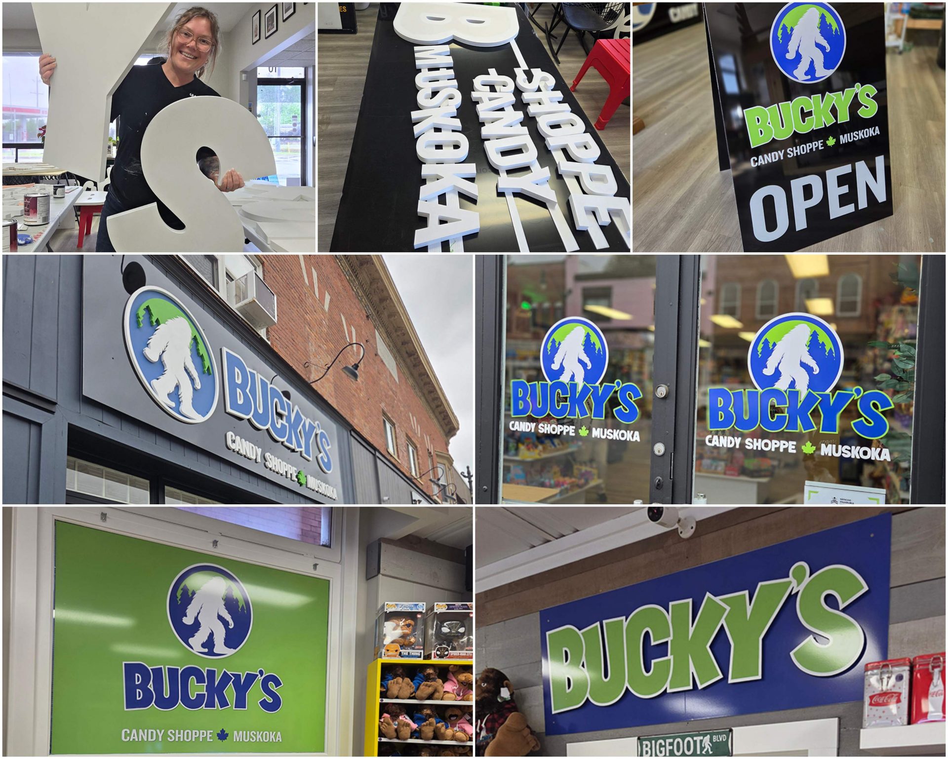
Our main challenge was figuring out how to create the angled overlap of the letters while ensuring the best possible adhesion between the sign foam and the ACP. Jon Maconachie, sign production manager at Route North, decided to create custom angled sign foam sections based on how each letter overlapped the next. He placed each letter, marked the area, took measurements, and cut the pieces on the CNC router. The angled supports were then primed and painted black so they wouldn’t be noticeable under the letters. Piece by piece, each letter overlapped perfectly and adhered properly to the ACP surface.
Thanks to thorough planning, installation went incredibly smoothly. Jon and Mike pre-installed wood strapping at the install site so everything could be mounted immediately. We had prepped the panels in our shop, and even the letters that overlapped at seams were positioned to align perfectly once on-site.
After the large dimensional sign was up, we moved inside to complete the window graphics and interior signage, which tied the whole space together. We’re so proud of how it turned out—from the look to the feel of the sign, it truly reflects the client and what he envisioned.
Griffin’s golden glow
When Route North Signs & Graphics opened in Bracebridge, Ont., we discovered The Griffin Pub during a lunch outing. Tucked away off the beaten path, it felt like its own little world—you had to take an alley to find this gem. The signage, however, was very old and, we felt, didn’t reflect the pub’s unique vibe. Two years later, we were thrilled when Ben contacted us to update the signs.
We were more than happy to oblige.
We began initial ideas and concept development in January 2025, with the project completed by early June 2025.

Old world charm
Ben aimed for an old-school English pub feel, which aligned perfectly with our vision. To achieve the look, we went for dimensional elements, moody colours, and vintage gold accents.
Ben had recently rebranded with a new logo and wanted the signage to reflect that. He provided the logo files, and we adapted them to various sign shapes and design options for his review. We created one sign featuring just the emblem, and another with the full name, both designed to blend well together.
The fabrication process involved a combination of 25.4-mm (1-in.) and 12.7-mm (0.5-in.) thick high-density urethane (HDU) sign foam, all cut on our CNC router and prepped in-house. Each piece was sealed, primed, and hand-painted before the final assembly.
For installation, we used clear Gorilla Glue and 3M VHB tape for the lettering. The signs were hung using shackle hooks and chain on existing brackets, which we removed ahead of time for sanding, priming, and repainting to match the new signs.
There were no major challenges—our focus was ensuring the result matched Ben’s expectations. As much as we enjoyed the fabrication process and loved how the signs came together, the client’s satisfaction was our top priority.
Installation was straightforward. The signs were mounted to the refinished existing brackets using shackle hooks and chain. We drilled holes at the tops of the signs for the hardware, then used ladders to install them and gave everything a final wipe-down to remove any fingerprints.
These are the kinds of projects we truly enjoy—ones that reflect the character of the business while allowing us to build and add to our portfolio. A win-win.
Lisa Armstrong is the owner of Route North Signs & Graphics Inc., with 20 years of hands-on experience in the sign industry. Having worked across a wide range of signage styles—from hand-painted wood signs to full vehicle wraps—she brings a deep understanding of design, fabrication, and installation.
Sign up for our newsletter
Featuring breaking news from Canada's sign and graphics industry.
Products
Read the Latest Issue

