
Wayfinding: Demystifying the design process
Design
Inspired by architecture firm Kohn Pedersen Fox’s (KPF’s) design of the complex, several signage schemes were put forward to the client, each involving a different approach to letter illumination.
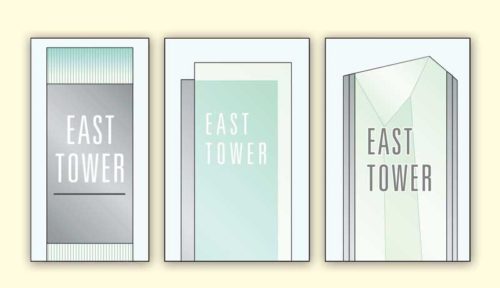
The first was inspired by how the building’s components were offset slightly from each other. Translucent glass would similarly be offset from a metal lightbox base, creating a light and airy esthetic reflecting the building’s own details and materials.
The second was based specifically on crystalline skylights the architects planned to place over the main plaza. Faceted, bevelled or layered glass would connect with a metal lightbox in a more angular, asymmetrical and dimensional manner.
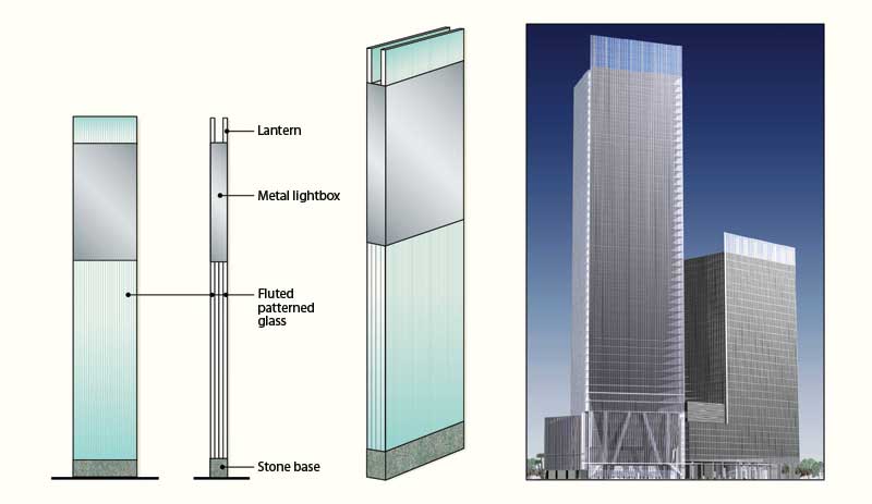
Finally, the third scheme was informed by the top of each office tower, which featured an illuminated ‘crown.’ Sitting on a stone base, each sign would feature fluted, patterned glass supporting a metal lightbox and, on top, a ‘lantern’ nicknamed the crew cut. This sleek, clean and elegant design would more literally represent the buildings’ form.
In the end, the client went with the third option. It was perhaps the most conservative of the three, but it was also highly referential to the building and could be more easily adapted than the others to a number of formats, from free-standing totems to ceiling-suspended signs to wall plaques to projecting signs—as well as different sizes, which at that point were not yet known, as the content had yet to be determined.
After constructing scale models, some of which lighted up, the designers proposed for the crew cut signs to be made of laminated glass and internally illuminated. This raised the question of whether the glass would be self-supporting or would require an internal frame. Glass suppliers and engineers determined the glass-body totem signs, some of which were 3 m (10 ft) tall, could indeed be self-supporting.
The complex’s primary identification signage had to be adapted for two entrances, including the main one on Raffles Quay and another designed to accommodate vehicular passenger drop-offs and pickups. The concept for the drop-off entrance was a waterside series of free-standing glass letterforms with metal surrounds, pedestal supports and external illumination.
For the underground parking lot, meanwhile, different colours were chosen for each level, along with tall, thin graphics that would relate visually to the rest of the overall sign system.
Further design development involved scheduling the signs’ messages, along with site-plan sketches indicating viewing distances from where each sign would be installed and its foundation requirements (e.g. electrical power connections). A wide variety of colour and material samples were tested for their appropriateness, weight, grain and finish, while graphics were planned in terms of type style, size and letter spacing.
During this process, the designers sought input and advice from multiple fabricators and engineers, which provide invaluable to the team in ensuring the project’s success. Finally, documentation was completed with the creation of detailed drawings for fabrication.
Post-design
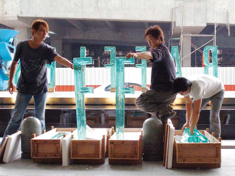
One of the big questions at this point was whether or not the drop-off entrance’s 1-m (3.3-ft) tall waterside letters could be cast in glass for a hand-crafted, artistic esthetic as a counterpoint to the rigid structure of the building. In Singapore’s hot climate, especially, the glass would provide the softer, cooling image of a green oasis. The designers found a vendor and co-ordinated efforts with architects and engineers to develop a series of prototypes.
The glass was cast in 15-mm (0.6-in.) thick steel moulds, which had to be custom-welded for each letter. It proved difficult to cool glass of that thickness—multiple letters cracked during the annealing process before a complete set with consistent colouring and distribution of bubbles within the glass was produced. Extra letters were also stored as replacements in the event of breakage.
The final, successful letters were cemented into place within a stainless steel ‘boot’, which was then levelled and overclad in stone. It was very important to keep the letters protected during installation at what was still an active construction site.
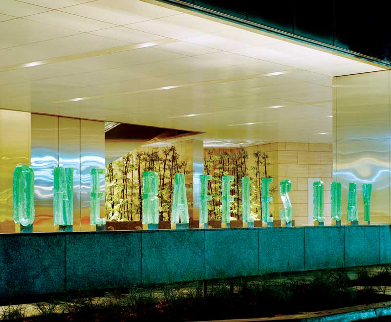
At the other entrance, the letters were built into the face of a fountain instead. From a localized engineering standpoint, it was essential to ensure the fountain would not leak and short out the letters’ lighting system. The lighting was also tested at night to ensure it provided the desired appearance.
In the parking lot, the colourful graphics were sprayed on-site, rather than digitally printed as decals and then applied to the walls. The results looked just like the original designs.
Imposing a brand
After the installation, the green glass letters identifying ORQ became particularly iconic for photo opportunities, including one for the cover of the complex’s developer’s annual report. They were a strong example of how signage can impose a singular brand and personality across a large-scale facility.
Indeed, clients come to appreciate how a space can be transformed with signs and graphics much more easily and affordably than with architectural treatments. The key to success is the relationship between signage and branding; it all needs to work together.
Chris Calori and David Vanden-Eynden are partners in C&VE, a design consultancy known for signage, wayfinding and user navigation systems, and co-authors of Signage and Wayfinding Design. This article is based on a seminar they presented at the International Sign Association’s (ISA’s) 2016 International Sign Expo. For more information, visit www.cvedesign.com and www.signs.org.
Sign up for our newsletter
Featuring breaking news from Canada's sign and graphics industry.
Read the Latest Issue
