
Hastings: A sign made for the spotlight
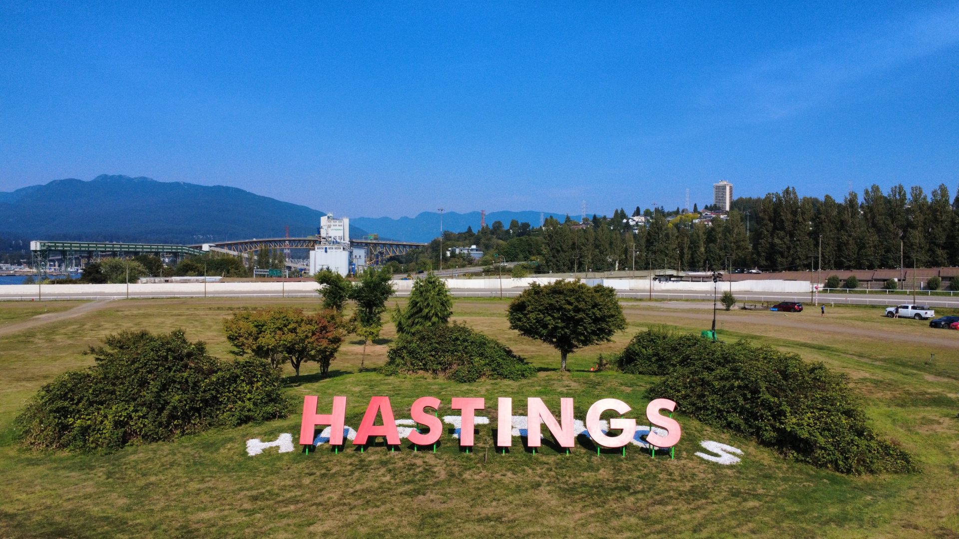
At a large, high-visibility venue such as Hastings Racecourse & Casino, its new sign works just as hard on camera as it does in person. Signs do more than mark a place—they shape how it’s seen, remembered, and experienced. That challenge came into focus when Century Signs was commissioned to fabricate a new feature sign spelling out HASTINGS in eight oversized dimensional letters. Measuring 13.7 m (45 ft) long and nearly 2.13 m (7 ft) high, the installation was designed for impact from the grandstand, the grounds, and television broadcasts, combining careful engineering, custom fabrication, and precise placement to ensure the sign delivers a bold, consistent presence from every angle.
Century Signs’ long-standing relationship with Hastings Racecourse & Casino played a key role in securing this project. Early in 2025, Hastings approached us with the goal of refreshing their signage across the property and exploring a new feature sign that would make a bold statement. After reviewing their options, they chose to move forward with the new HASTINGS sign, recognizing it as a powerful addition that would immediately enhance their brand presence.
Timeline
The project was approved in July 2025, and our team quickly moved into production at the start of August. Thanks to careful planning and co-ordination, the work progressed smoothly, and the installation was successfully completed by the end of the month.
Scope
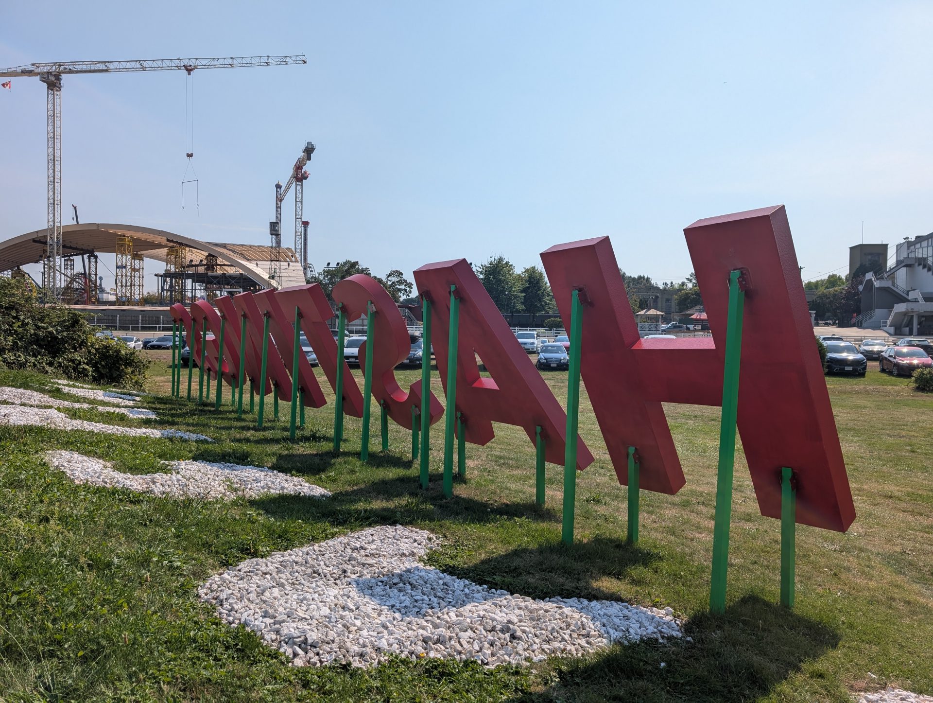
Century Signs was commissioned to fabricate eight large dimensional letters spelling out HASTINGS. Once installed, the sign measures 13.7 m (45 ft) in length and approximately 2.13 m (7 ft) in height. Each letter was crafted from 152.4 mm (6-in.)-thick foam, custom-painted in the client’s branded red. Since the sign needed to be clearly visible both from the grandstand and through television cameras, it was installed at a 60-degree angle for maximum impact.
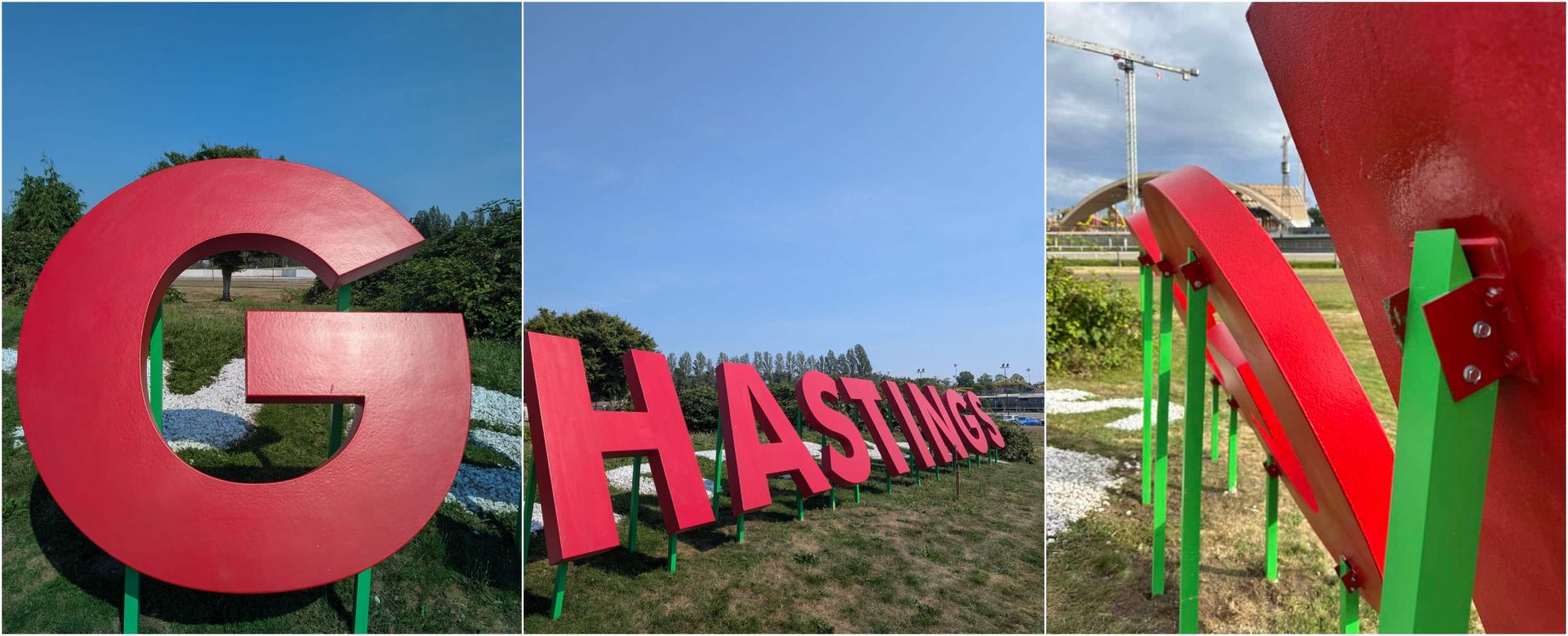
To achieve this, our team engineered custom angle bars, cutting them to varying lengths and painting them green to accommodate the sloped ground where the sign was placed. They also reinforced each letter with four aluminum tubes on the back, extending two of them to create and maintain the precise 60-degree angle. This approach ensured the letters were uniform, stable, and visually striking from every vantage point.
Design and fabrication
All design work was handled in-house by Century Signs. The client’s only request was that we use their branded font and signature red colour, and from there, our team developed the complete design solution.
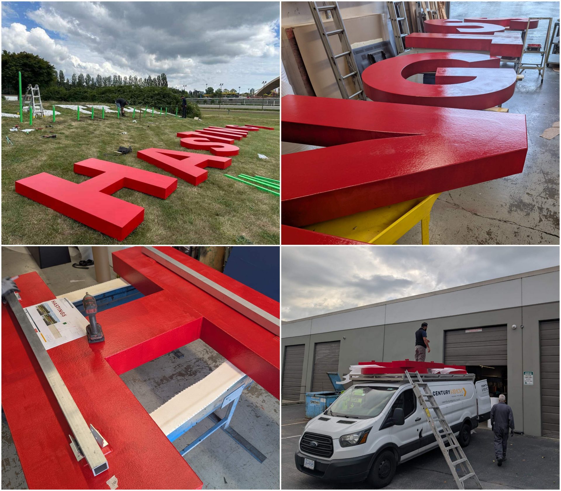
Each letter stands 1,778 mm (70 in.) tall and features computer-numerical control (CNC)-cut, 152.4 mm (6-in.)-thick foam reinforced internally with aluminum plates. The team built the support structure using four custom aluminum tube posts and secured them to each letter with custom brackets and stainless-steel hardware to ensure longevity and stability.
Due to the size and thickness, we partnered with a local specialist to cut the foam letters with precision and apply a hard coat on the face. Once received, our team applied multiple coats of the red paint to achieve a bold and consistent finish. Our in-house metal shop fabricated the aluminum tubes to size, cutting the tops at precise angles to create the required 60-degree tilt for installation. Each support was then painted with a polyurethane coating for additional weather protection.
Challenges
The installation came with its share of challenges, from unexpectedly hard ground to uneven terrain. Our team adapted quickly, bringing in an auger to dig the post holes and carrying each 1,778 mm (70 in.) letter and hardware on foot. To achieve perfect alignment across the sloped site, we used a simple string line method that ensured every post and letter lined up exactly as planned. These practical solutions kept the project on track and delivered the striking result the client envisioned.
Installation
Installation began with a string line to establish a level reference, ensuring the letters would align evenly across the 45-foot span. The team dug the post holes to the proper depth with an auger, ensuring the aluminum tubes were set securely. Once they positioned the tubes, they filled the holes with Sika Post Fix, a fast-setting two-part polyurethane material that created a strong, stable foundation. Finally, the team secured each letter to the posts with heavy-duty bolts and angle brackets, completing an installation that was accurate, durable, and built to last.
Conclusion
The new HASTINGS sign has already become a standout feature of the racecourse, capturing attention from the grandstand and on TV. It’s a perfect example of how thoughtful design, precise fabrication, and skilled installation come together to create signage that makes a lasting impression.
Khuram Shahzad is a seasoned professional with more than a decade of experience in the signage industry. As a marketer, he possesses a keen understanding of customer needs and excels at capturing their attention online and offline. His expertise in brand promotion has consistently driven increased revenues, showcasing his ability to bridge the gap between customer expectations and business goals effectively.
Sign up for our newsletter
Featuring breaking news from Canada's sign and graphics industry.
Products
Read the Latest Issue
