
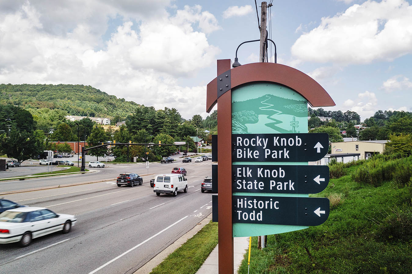
Channeling identity: Reflections on building a brand
In the sign industry, moving quickly from one project to the next is easy. But looking back—truly reflecting—reminds us why we do this work. Some signs do more than identify a business; they help define it. They capture a moment, support a vision, and become part of the landscape.
One of those projects for us was Culaccino Bar + Kitchen. Located in downtown Burlington, Ont., Culaccino is an Italian restaurant with more than 150 Ontario and Italian beer selections. They occupy a beautifully renovated former National Trust bank on bustling Brant Street. It’s been almost a decade since its sign first appeared on this new brand, but it remains a landmark we stand very proud of, because it is the perfect example of a brand that was elevated by its signs. Our goal from the outset was to transform this space into something special and build a brand. Standout exterior signage and interior warm lighting were critical to that vision.
How it started
The collaboration began over a decade ago. When Jerod started pursuing his dream of opening a restaurant, he teamed up with his father Mark, who brought 30 years’ experience with Molson Coors to the table. Jerod, a former varsity football player graduating from Western University with a degree in business management on a full football scholarship, is a friend of mine. We sat down and started discussing ideas and his vision for this acquired space.
LED Solutions contributed to the design of the signage and helped shape Culaccino into the experience as it exists today.
Timeline
We started doing drawings for this project in March of 2016. We were approved for permits in late May and began fabricating and installing in June, and they opened their doors to Burlington—a big success right from the start.
Scope
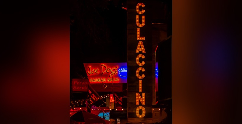
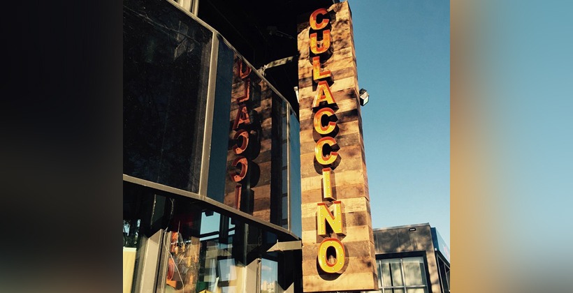
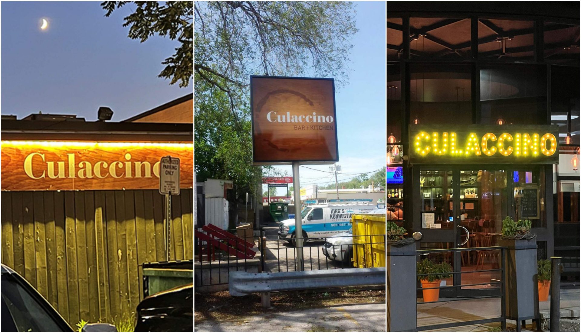
There was an existing large steel blade sign in the patio space facing Brant Street that we recladded using reclaimed wood and added illuminated channel letters on both sides. We also fabricated a new sign box with illuminated channel letters over the front entrance doors.
At the back of the building is the parking lot with an existing large pylon sign that we retrofitted to LED and made new faces on both sides, and then we added some branding on the rear wall with an LED light bar overtop.
Design
We had a whole team working on this project—the owners, their designer, and the design team at LED Solutions. The concept was well defined—we needed to turn the exterior signage and interior lighting into something that matched and complemented their idea.
One interesting note is that “Culaccino” means “a watermark left on a table from a cold beverage”—you’ll see this watermark design on their digital prints.
Fabrication
We added some structure to the existing steel blade sign to prepare it for wood cladding. The blade sign is 3.05 m (10 ft) tall x 0.61 m (2 ft) wide. We fabricated a low-profile sign box clad in reclaimed wood that was 2.44 m (8 ft) long x 0.61 m (2 ft) tall.
Then we fabricated three sets of open-faced channel letters, which were painted black on the outside and burnt orange on the inside, illuminated by exposed marquee-style warm white LED bulbs. All the channel letters were the same size on the double-sided blade and front door entrance, lending to the visual flow and design.
For the large pylon in the back, we made new Lexan faces and aluminum frames with digital print on both sides— 1.83 m x 1.83 m (6 ft x 6 ft).
Finishing off the fabrication was an aluminum composite material (ACM) sign with a digital print and warm white light bar above, measuring 0.61 m (2 ft) tall x 3.66 m (12 ft) long.
Challenges
One of the challenges we faced was that all this reclaimed wood cladding came from Sudbury, Ont., from an old barn. It arrived by flatbed, and then we selected the pieces we needed. So, we didn’t know the condition or colouring of this wood until it arrived. The inside is also clad in this same wood. While selecting the reclaimed boards we needed, we had to make sure the grain and colouring matched so the signage looked uniform.
A second challenge was selecting the right marquee bulb for the exposed channel letters. After testing a dozen types, we went with a 2700 kelvin warm yellow colour that perfectly complemented the burnt orange interior.
Installation
We reinstalled the blade sign onsite and installed the channel lettering. We had the sign box and channel letters for the front entrance preassembled at the shop and installed on the entrance canopy.
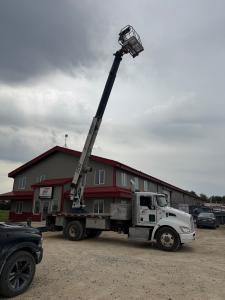
The rear pylon faces and frame were lifted into place and secured with our bucket truck, and the ACM panel was installed with the LED light bar. Then, we wired everything up and tested.
Reflections
We are very proud to say that, after nine years, we have not had one repair on any element of this project. That speaks to the craftsmanship and quality of materials we used on this project.
William Large co-owns LED Solutions with Mike LeBlanc. For 20 years, they’ve been designing, building, and installing signs nationwide, with many team members having been with them from the start. Their work features in strip malls, major brands, national accounts, and high rises in the Greater Toronto Area (GTA) skyline. For more, visit their social media on all major platforms and their website at www.ledsolutions.ca.
Sign up for our newsletter
Featuring breaking news from Canada's sign and graphics industry.
Products
Read the Latest Issue
