
Access granted: The evolution of accessible signs
New materials bring new possibilities for accessible signage
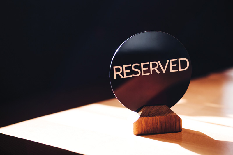
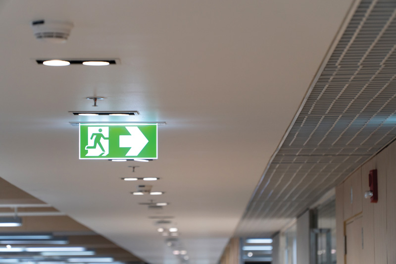
When entering a large building for the first time—say, a hospital or office complex—most of us first search for signs leading us to our destination. We search for directions to a specific floor, department, office, or maybe a restroom or bank of elevators. We take these signs for granted—perhaps not noticing them on subsequent visits—but their presence is critical to navigating a new space.
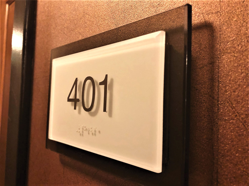
Such signs are a lifeline for those with impaired vision or severe anxiety. Whether braille signage is used for those with a complete lack of sight or high-contrast, or low-glare signs to accommodate others with visual impairments such as colour-blindness, wayfinding signs that comply with national guidelines are essential in almost any public space.
There is no single national standard for accessible signage in Canada, but guidelines and laws serve this purpose. These include the Accessible Canada Act (ACA), the CSA Group (formerly the Canadian Standards Association), Braille Literacy Canada’s Accessible Signage Guidelines, and the United Nations Convention on the Rights of Persons with Disabilities (UNCRPD).
At one time, accessible signage was an afterthought—a box to check to ensure compliance—and its effectiveness and esthetic appeal reflected that inattention to detail. In buildings and public spaces that otherwise were treated as brand and destination showpieces, accessible signage too often stood out for its plainness. Worse yet, the materials and design of those signs didn’t always meet the needs of the disabled visitors who relied on them.
All of this is changing.
“Good sign design should consider not only the visually impaired, but also older individuals, people facing mental health issues, those in emotional distress, non-English readers, and children and others who can’t read at all,” says April Christiansen, co-founder of ZAC Collaborative and a 20-year veteran of the sign industry. “Effective signage leverages text, pictograms, colour-coding and braille to meet the needs of all visitors.”
Today, more thoughtful regulations, greater awareness of the physical and emotional challenges many people face, increased focus on brand presentation and extensions, and innovations in signage and sign materials are driving new, creative approaches to accessible signage.
Innovations
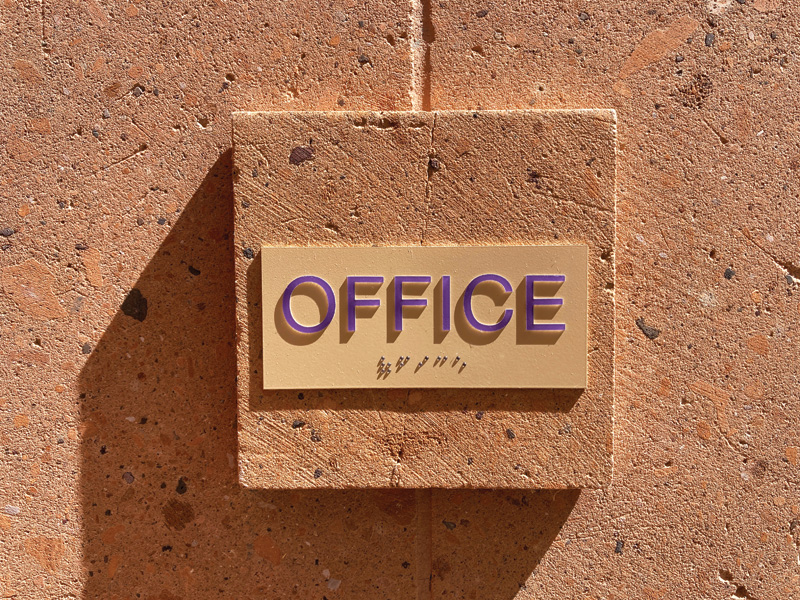
Innovations in materials and printing processes are making more creative, effective, and accessible signage possible. This includes tactile or 3D printing, which allows sign manufacturers to print braille lettering directly onto acrylic sheets. In the past, the raised dots that make up braille letters had to be applied separately, but 3D printing is faster, more affordable, and easier than drilling and setting braille letters.
Printing directly onto acrylic offers other advantages. It opens the whole spectrum of colours, meaning organizations can create signs with Pantone-specific colours matching their brand palette or introduce other visual effects, such as fades, gradients, textures, and faux finishes such as corten or wood grain. Using real wood or metal can be expensive, so organizations are increasingly trying to value-engineer their signage to create the look of wood, rusted metal, or steel without the same price tag.
Direct printing also enables first-surface printing, meaning text and shapes can be printed on the back of the acrylic sheet—the side facing the wall on wall-mounted signs. This protects the text from exposure, breakage, or defacement. Advances in the acrylic itself also make this possible. In the past, standard acrylic was so smooth that ink would not bite into the substrate and would chip off when the sheet was cut. New direct-to-print or digital acrylic holds the ink to prevent chipping and peeling.
Compliance
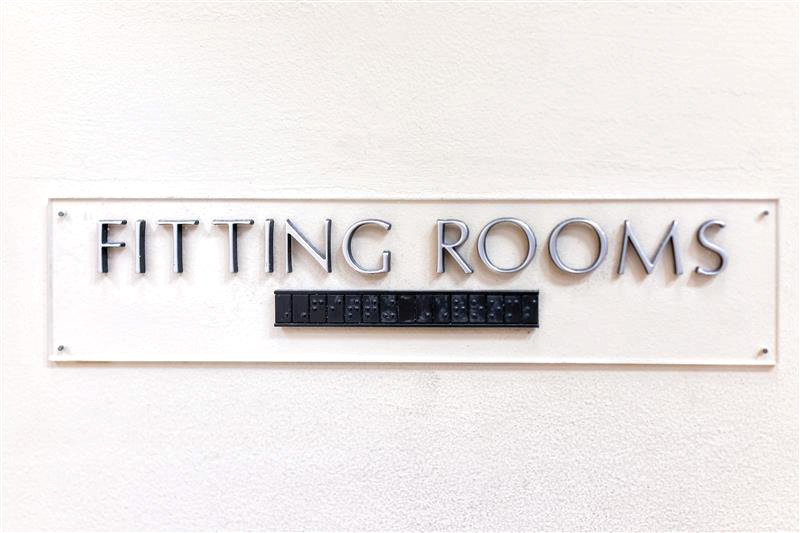
Specifically, the CSA Group’s Standard B651-18, Accessible design for the built environment, in Sections 4.5.1 and 4.5.2, states signage should be “positioned to avoid shadow areas and glare” and “have a glare-free surface.” Adding a non-glare finish to a traditional sheet can haze and dull the sheet, making the text on the back side difficult to see. New models of digital acrylic sheets offer inherent non-glare properties, preventing hazing and clearly displaying first surface printing to comply with national standards.
This standard addresses the contrast between characters and background, stating an accessible sign must be colour-contrasted with its background, with the characters on the sign colour-contrasted by at least 70 per cent with their background. This is consistent with the industry’s best practices. Contrast is critical to readability for individuals with diminished eyesight, especially many forms of colour-blindness. Maintaining contrast and non-glare compliance has been a significant challenge for accessible signage manufacturers, but these innovations in signage materials make it possible.
“Because all of this is possible, we’re starting to see real interest in using accessible signage to create a special feeling about the sign and the building,” Christiansen says. “It used to be simple, plain, even unattractive, and treated as if it didn’t matter. More and more, people see these signs as a way to extend their brand and make them part of the experience while also being more inclusive.”
The bottom line
New materials and printing processes have opened a new universe of possibilities for accessible signage, and designers and brands are learning how to take advantage. More versatile forms of acrylic sheets, paired with 3D printing, enable creative combinations of colours and finishes on these signs while enhancing their readability and effectiveness for the primary audiences.
Scott Walton is the national sales manager of sign & graphics at PLASKOLITE.
Sign up for our newsletter
Featuring breaking news from Canada's sign and graphics industry.
Products
Read the Latest Issue
