
Master the subtle art of harmonizing colour and print

Let’s say you’ve got this beautifully painted structure, maybe it’s a shiny metal panel or a perfectly smooth composite material. And now, you need to match it with a wide-format digital print. Easy, right? Not quite. It’s like matching socks fresh out of the laundry; they look the same, but under different light… yikes! So, let’s get into the nitty-gritty of ensuring your prints and paints are singing the same tune.
The challenge of matching prints to paint and architectural finishes
Digital inkjet prints are typically produced on vinyl, fabric, or rigid boards. On the flip side, painted structures love metal, wood, or composites. Now, toss in fancy architectural finishes like anodized aluminum, powder-coated metals, and brushed steel, and you’ve got a bit of a circus of reflectivity, texture, and gloss. Imagine trying to get a disco ball and a velvet curtain to look like the same shade of red. Yeah, that’s the challenge.
Quick tip: Always check your prints and painted samples under the actual lighting they will live in. What looks perfect in the shop might look like a completely different shade on a sunny Tuesday afternoon.
Paints are thick and juicy with pigment, while inkjet inks are more like a whisper of colour layered in tiny droplets. This means that matching them perfectly isn’t just about picking the right shade—it’s about understanding how light bounces off them. Let’s break it down.
Prerequisites for colour matching success
Before you even think about matching those gorgeous prints to your painted masterpiece, you need the right tools. Trying to match colours without them is like baking a cake without an oven. Here’s what you need:
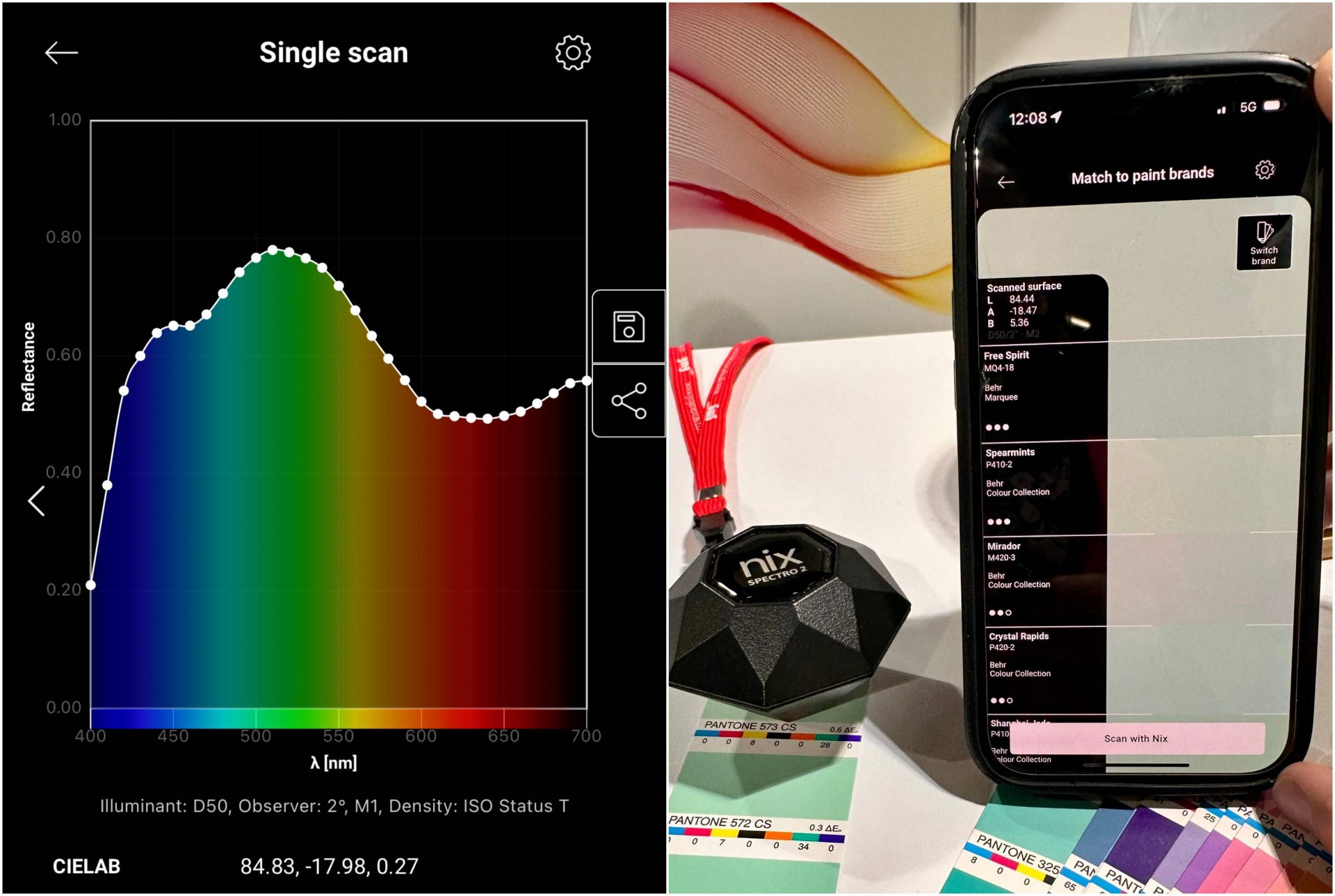
High-quality spectrophotometer:
This little gadget measures colour values. Think of it as the colour police—making sure everything is on point. Multi-angle or sphere models are recommended if you’re dealing with fancy metallics or glass-like reflective surfaces.
Well-calibrated printer:
Your printer needs to be in top shape—no “well, it looks right.” It requires regular check-ups, just like your car. Linearization, ink density verifications—the whole nine yards.
Colour-managed Raster Image Processor (RIP) software:
This is the brain of your digital print operation. It translates your beautiful design into printer language, so what you see on screen is what you get on print. Without it, you’re basically guessing.
Controlled viewing environment:
You wouldn’t buy a car without looking at it in daylight, right? The same goes for colour matching. Make sure you’re checking things under consistent light like D50 or D65 standards.
Pro setup tip: Want to level up? Try the X-Rite i1Pro 3 Plus or Barbieri Spectro LFPqb for large-format jobs. Combined with a high-quality colour management engine and RIP, you will be a colour-matching ninja.
Spectrophotometers:
The colour detectives. If you have ever wished for a gadget to look at a colour and tell you its secrets, meet the spectrophotometer. This little device is like a bouncer for colours, checking IDs, and making sure everything is legit.
The big three products
45/0 spectrophotometers (e.g., X-Rite i1Pro3 Plus & Barbieri Spectro LFPqb)
These are the bread and butter of colour measurement. They measure colour just like your eyes do—head-on. Perfect for smooth, flat surfaces like painted panels and your digital print.
Bonus: They’re widely supported by RIP software, so your digital print shop doesn’t break into a sweat trying to read the data and get your printers dialed in.
Sphere and multi-angle spectrophotometers (e.g., benchtop, X-Rite Ci64)
If the surface is flashy, like metallic paint or pearlescent finishes, you need the fancy gear. These spectros catch the colour from all angles.
They are handy for things that shimmer or shift in the light, like custom automotive finishes or brushed aluminum.
The downside? They cost more than a decent vacation and aren’t usually RIP-friendly.
Affordable compact spectrophotometers (e.g., NIX)
These pocket-sized wonders are perfect for quick checks. Think of them as the colour scouts before the real heavy hitters come in.
They are great for architectural touch-ups and real-time visualizations right on your phone.
Cost consideration: Want the fancy multi-angle models? Get ready to open your wallet. For most print jobs, 45/0 spectros are your best bet and essential for a colour-managed print environment.
Why CMYK values from paint suppliers fall short
Ever get a paint supplier telling you, “Here’s the CMYK breakdown!” and think, “Great, I’m all set!”? Yeah, not quite. Cyan, Magenta, Yellow, and Key (CMYK) is like getting a one-size-fits-all t-shirt—it fits, but not perfectly.
The issues:
Device dependency: Those values only work right for the press they were made for. For example, GRACoL offset printing specs. If you switch it to an inkjet? All bets are off.
Inkjet gamut advantage: Inkjet printers can hit more colours than offset. So, why settle for less? Saturated and bright colours defined with lightness, red/green value, and blue/yellow value (L*A*B*) can get you out of the CMYK confines and get you matching spot on.
Visual tuning: You might need to fine-tune the result with good old-fashioned eyeballing and swatch matching.
Pro tip: LAB values are your friend. They don’t care what printer you use—they want you to get the colour right. Use them if provided, and ideally measure them with your spectro in your spot colour library.
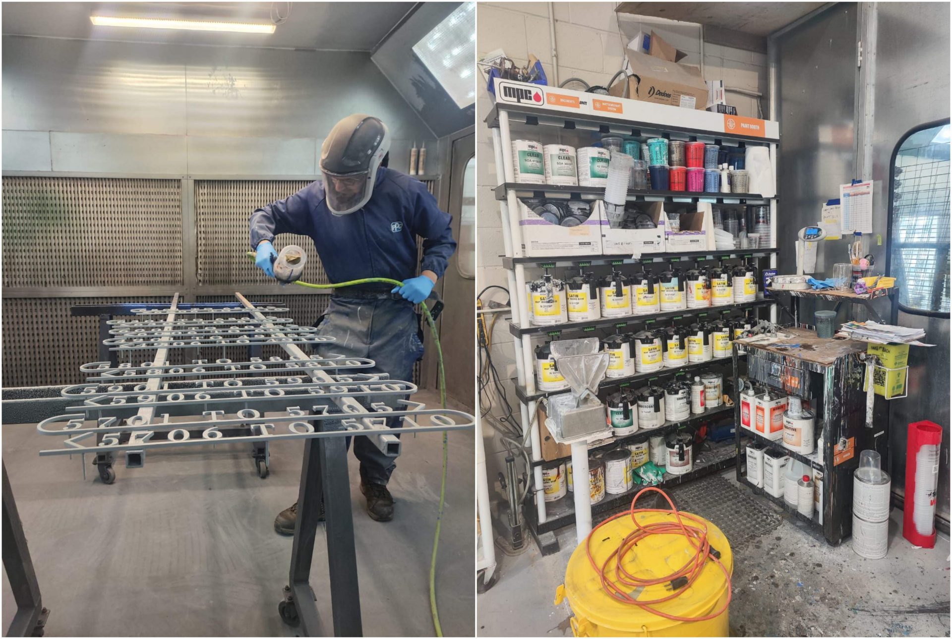
The magic of clear coats and laminates
Here’s the thing: when you slap a clear coat on paint or a laminate on a print, you’re basically putting on sunglasses—everything looks deeper and more intense. But just like with sunglasses, not all clear coats are created equal.
Clear coat on paint:
Adds between 0.05 and 0.15 D (density). That’s geek-speak for “it looks darker and richer.” High-gloss finishes turn up the volume on saturation. It’s like your colour hit the gym. Metallics especially love a good clearcoat. They shimmer.
Laminate on print:
Laminates bump up the density by about 0.03 to 0.10 D. Glossy laminates make colours pop like they’re on steroids. Matte laminates? A bit more chill. Ultraviolet (UV)-cured liquid laminates add even more oomph than the standard thermal ones.
What makes it pop?
Material type: Gloss, satin, or matte—each changes how the light dances off it.
Thickness: More layers? More pop.
Substrate absorption: If the surface soaks up ink like a sponge, it’ll look darker.
Ink and print tech: UV inks versus solvent inks… It’s like diesel versus regular fuel. Both get you there, but the ride is different and leaves different visual impressions and gloss differentials.
Keeping it correct:
Environmental exposure: You wouldn’t leave a snowman out in July, right? The same goes for your prints and paints. UV exposure, rain, and weather changes can fade and mess with your colours. Get some UV protection and weather-resistant coatings, or prepare to reprint or repaint sooner than you’d like.
Pro tip: Test a sample before you go full throttle. You might love it—or you might wonder why your red looks like it’s blushing.
Real-world example: Matching a branded facade with wide-format prints
Let’s put this into perspective with a real-world scenario. Imagine you’re working with a big retail brand—let’s say a major athletic company. They want their storefront to be as bold and vibrant as their digital ads, right down to the last drop of red in their logo. Let’s dive into it.
The setup:
The store has a brushed aluminum facade painted in their signature red. It’s got this beautiful metallic sheen that catches the sunlight.
You’ve been tasked with producing wide-format window graphics that need to match that exact shade of red—not just in sunlight but under evening lights as well.
The game plan
Spectrophotometer magic:
First, you break out the spectrophotometer and measure the painted aluminum facade under D50 lighting. You capture the LAB values, not just CMYK, because you want it to match regardless of the printer.
Profiling and proofing:
You use those LAB values to create a custom profile for your RIP software. Now you’re talking the printer’s language. After running a proof on a glossy vinyl substrate (to mimic that reflective aluminum), you check it under different lighting—shop lights, daylight, and even LED strips.
Visual tuning:
Here’s where you get picky. Using visual tuning charts, you adjust the colour slightly to account for how it will look from the street. A little tweak here, a nudge there—you’re Michelangelo with a digital brush.
Lamination and coating:
You laminate the print with a high-gloss finish to push that saturation, so it matches that metallic shine on the aluminum.
Final check and install:
Before you ship it out, you do a final check side-by-side with the facade—under the same lighting it’ll be displayed in. Perfect match? Nailed it.
And just like that, your window graphics and painted aluminum look like they were made for each other. The storefront is bold, vibrant, and perfectly on
-brand. Cue the applause.
Erik Schmitt heads GMG Color in Canada from Toronto. With two decades in print, he’s obsessed with software, colour management, and the visible spectrum. Off the clock, he’s fixing bikes and riding with his two daughters.
Sign up for our newsletter
Featuring breaking news from Canada's sign and graphics industry.
Products


Read the Latest Issue

